Featured

Optimizing Data Transfer Cost on AWS Infrastructure

Most of you would surely agree that  AWS billing mechanism is too complex and difficult to understand if you have limited experience with it. Any AWS bill where the system is internet facing and using different distributed systems internally, it is not unusual to see 15-20% bill pertaining to data transfer cost of over all AWS spend. This data cost is a result of data transfer happening between your systems available in different availability zones/ region or data being sent over the internet for serving end users. 

The focus of this blog post is to share our experience with the same and navigate with different mechanisms that we used to control our data transfer cost which resulted in of approx 50% data transfer cost saving. Alright !! so let’s get started. 

Let’s start by grasping the setup and pinpointing where AWS introduces charges.

  • Inter-Availability Zone Data Transfer (Same Region): Data transferred between resources in different Availability Zones within the same region incur data transfer costs.
  • Data Transfer Between AWS Regions: Data Transfer Between AWS Regions: When data is transferred between AWS regions (e.g., from a server in the US East region to a server in the EU West region), it incurs data transfer costs, which are typically higher than data transfer within a single region.
  • Data Transfer over the Internet: Data transferred between AWS resources and the public internet may have separate data transfer costs. For example, if you have an EC2 instance that communicates with external users or services on the internet, outbound data transfer from the EC2 instance to the internet may incur costs.

The diagram presented below serves to elucidate the distinct conditions governing AWS data transfer charges. It gives you a visual snapshot of how a high-availability setup could look. Remember, this illustration is just a simplified representation, and the way your actual high-availability setup appears might have some differences. However if you deploy your application in HA your setup can appears to be a degree of resemblance.

At first glance, the costs might seem quite low when you use the AWS price calculator. However, keep in mind that these expenses can grow substantially, especially when you’re moving large amounts of data, even reaching terabytes.

Why Applications are Sending or Receiving the Data in Terabytes (TB) …

Let’s take an example of an Application, it’s might connected with MySQL, Elasticsearch and a NoSQL and you deploy your instances in the same AWS region but on a different availability zone to provide more reliability, Now here is the additional cost comes because are saving and retrieving data from different availability zone it will cost you, And when your application builds to serve for huge traffic like ecommerce, gaming or healthcare application, your data IN and OUT might go up to terabytes or more.

Now let’s figure out the how we can control the data within the platform First find out the data leakage in your application, it may be spread all over, but you can start from your application server first and enable the compressions techniques.

Enable Compression in Applications Server

By enabling compression in your Spring Boot server, you can reduce the size of data transferred over the network, leading to faster responses and improved overall performance for your application

Once you have enabled compression and set the appropriate properties, you can test it by making HTTP requests to your Spring Boot server and checking the response headers. The “Content-Encoding” header should indicate that the content has been compressed with Gzip

Customize Compression in Memcached for a Java application

Data Transfer Between Elasticsearch Nodes in different Availability Zone

Application servers which utilizes the data of ES nodes are often configured to fetch the data from ES nodes in round robin manner. This enables data transfer event between two different availability zone between Application server and elastic node.

However ES client/Application server can be configured in such a way that it will always look for ES node available in the same availability zone. In case if the server available in that zone is not available it will fall back to other nodes in different availability zone.

Below is an example code of ES java client that helps data move within a single availability zone using ElasticSearch.

Add Selective Retrieval and Compression at MySQL

Now add Compression between your application and the DB server. It will defiantly reduce some data transfer and the second thing you can implement is the Selective Retrieval If you have large datasets but only need to access a subset of the data frequently, consider partitioning or indexing your data to enable selective retrieval. This approach can save costs and improve query performance by reducing the amount of data read or transferred.

jdbc:mysql://your-database-host:3306/your-database-name?useCompression=true

Enable Client Side Configuration to Reduce Internet Data Out

After applying above changes you will see data out is reduced sufficiently. However to reduce the internet data out you need to enable the client side configuration as well, this will help client application to identify that now he has to communicate with server in said encoding format.

const headers = new Headers(req.headers)
headers.set('Content-Type', 'application/json')
headers.set('Content-Encoding', 'gzip')

return NextResponse.json(data, { status: 200, headers })`

Lastly, Ensure a Comprehensive Examination of your S3 Configuration is Carried out.

Typically, AWS S3 is utilized for storing static assets like JavaScript, images, and CSS. These resources are often distributed through CDN providers for improved speed and cached delivery, as they are heavily accessed by client applications. Please make sure that these are getting accessed with compression enabled header. Also in our case we are using Cloudflare CDN on which data out bandwidth is free however data storage is S3 only. This enables us to access all our data from Cloudflare CDN, at the same time we make sure that no public access of S3 URL is available.

Realizing Cost Savings: By implementing these strategies, you will likely notice a noticeable reduction in your AWS Data Out charges. We encourage you to review our findings both before and after applying these techniques.

Please note that the above content is generated based on our own experience and setup. Please feel free to comment and send us the feedback in case your experience is different.

Image by Chaitawat Pawapoowadon from Pixabay

Featured

Scaling Regression Test Cases through parallelism – A Cloud Native Approach

Introduction

In the game of balancing out agility , quality and velocity for continuous business changes, automation regression keeps on growing along with your code base. A single line of code change in business logic results in creating multiple regression test cases. Also, it gets multi folded because this has to be tested on multiple devices and interfaces.

Engineering team spend lots of time in making sure our production systems are scaling and we are meeting our defined SLOs on production environment, at the same time test case regression time keeps on increasing and somehow takes a backseat until we realize that ‘Ohh it is taking half day to run all the test cases’, or sometimes may be more. This is where, your velocity of release goes for a toss. Any rerun and fixes need another iteration for same amount of time.

We went through with the same phase and our regression test case execution time increased in multifold and started touching to 12-15 hours to complete all the test cases on desktop/ simulators and multiple browsers. (How we scale on real mobile devices, is a topic for another blog post.)

We were able to reduce regression test case execution time by 75% using parallelism through cloud native approach & Making Regression test cases measurable through  real time analytics for quick recovery and replay of test cases. Lets dig this out in details here.

Problem Statement

HealthKart is a power house of brands, we have a single platform on which all our brand websites  (Muscleblaze.com, HKVitals.com. truebasics.com, Bgreen.com, Gritzo.com) and HealthKart.com marketplace is being run. Single change in core platform requires thousands of regression test cases to be run on different platforms and devices.

We have around 3000 cases which take full day of time for execution if any bug come in release during regression same time is take again to start over again.

Secondly, to get the failure report and rerun the failure of test cases we need to wait for the whole day to get the report because report came after all test cases execution.

Approaches for the solution

  1. Selenium GRID : Selenium Grid is a smart proxy server that makes it easy to run tests in parallel on multiple machines. This is done by routing commands to remote web browser instances, where one server acts as the hub. This hub routes test commands that are in JSON format to multiple registered Grid nodes.

The two major components of the Selenium Grid architecture are:

  • Hub is a server that accepts the access requests from the WebDriver client, routing the JSON test commands to the remote drives on nodes. It takes instructions from the client and executes them remotely on the various nodes in parallel
  • Node is a remote device that consists of a native OS and a remote WebDriver. It receives requests from the hub in the form of JSON test commands and executes them using WebDriver

Features :

  1. Parallel Test Execution (Local and Cloud-Based)
  2. Easy integration with existing selenium code .
  3. Seamless integration with existing code .
  4. Multi-Operating System Support

Cons :

  1. We have to maintain the nodes running through our own managed VM machines.Multiple nodes can provoke a full stop of test execution.
  2. Session Caches can create problem
  3. Challenges may emerge if multiple browsers are run on the same machine. We have to depend upon machine resources

2. Selenoid : Selenoid is a robust implementation of the Selenium hub using Docker containers to launch browsers. Fully isolated and reproducible environment.

Selenoid can launch an unhindered number of multiple browser versions concurrently.

Features :

  1. We don’t have to maintain the nodes running
  2. Containers provide enough level of isolation between browser processes so
      session cache is not a problem here
  3. Real browsers are available for all version .
  4. Easy integration with existing selenium code .
  5. Docker machine run on the fly whenever test cases are running and destroyed when test case got finished .

Cons : Community for the solution is too small .

3. Browerstack : Browerstack is third party tool which run your UI test suite in minutes with parallelization on a real browser and device cloud. Test on every commit without slowing down releases, and catch bugs early.

Features :

  1. Real devices and browsers are available with all versions
  2. We can run parallel test as per our package .
  3. Seamless integration with existing code .

Cons : Costly implementation. Price is too high with for more parallel .

Solution we implemented

  • We choose Selenoid due to ease of operability and its cloud native approach through Docker containers for achieving parallelism in distributed environment. Since we use different cloud providers in production vs dev, cloud native approach was life saver for us.
  • With parallel execution of test cases through Selenoid  we were able to bring the execution time to 3-4 hrs with 3000  cases . If any branch gets re-merged  due to any defect found is now planned and released in a couple of hours within time.
  • Integrating ELK stack for monitoring and analytics of test cases was required as test were getting executed in distributed environment and we were looking for log aggregation service which can be easily hooked in the solution architecture here. ELK stack was handy to go along. We were able to monitor and control and were able to find out the problems with test cases in real time.

Implementation of Selenoid

Selenoid is an open source project written in golang. It is an implementation of selenium grid using docker containers to launch browsers. Every time a new container is created for each test and it gets removed when the test ends. It helps in running tests in parallel mode. It also have selenoid UI which gives the clear picture of running test cases and capacity of running test case.

Scaling the test case capacity to run more parallel is just single configuration and also depends upon capacity of the VM where docker is launched.

Implementation of ELK

Often referred to as Elasticsearch, the ELK stack gives you the ability to send logs in JSON format and visualise that data through kibana. With ELK implementation we can get real time data of test case failure with reason and making it actionable to rerun if required from the console. 

What we achieved

  1. We were able to bring down our regression test case execution time to 75 % (12 hours to 3 hours). This has boosted our agility and velocity in the system at a larger scale.
  2. Measurable : With ELK implementation we can get real time data of test case failure with reason and making it actionable to rerun if required from the console.  This again a step ahead in agility and velocity of the system.

Benefit of Implementation is cost saving

  1. Agility – System is more agile and adaptive to change
  2. Velocity : Changes can be done at faster speed
  3. Ease of Scalability: Highly scalable structure . If we want to increase parallel execution of test count just we need to increase the value of parallelization configuration.
  4. Reliable : Real time analytics dashboard gives greater control on finding out the cause and replaying/fixing it in a faster way, this makes the system more reliable and adaptive.

Value Addition (Take Away from this)

Adding a parallel execution tool to our release cycle gives a clear picture of current test cases by making videos of particular cases which make debugging easier in case of bugs. Secondly, scaling the parallel execution is too easy which makes tester life easy .

The above content is an outcome of our experience while dealing with the above problem statement. Please feel free to make comments about your own experience.

Photo by Taylor Vick on Unsplash

HKVitals AI-Powered Hair Fall Test – Our Approach and Key Takeaways

Introduction

Hair loss is a significant problem in now a days. Even people in younger age groups are going through remarkable hair loss problems. Most common reasons are stress, poor diet, inadequate sleep, male pattern baldness etc.

Conventionally, for determining the stage of hair loss, one would need to go to a clinic. At HKVitals, we aim to change the conventional methods. The idea is to make hair test accessible to people at home, with a simple hair scan by phone camera.

Let’s dive into different approaches and algorithms we used for achieving this!

Ground Building – Starting up with Image Processing

During the initial phase of development, I tried achieving hair fall stage detection using Artificial Intelligence, however due to lack of proper datasets I had to fall back to Image Processing using OpenCV, idea was to use image processing, start collecting the data and once significant data is there, train the model using CNN and reinforce it as we collect more data.

First Approach – Pattern Matching by Mean Square Error

The first approach we opted for was Image Processing. We had primarily two reasons to choose Computer Vision. First, we were operating with images and computer vision based image processing is natural inclination. Second, the Mean Square Error approach can be readily implemented using Image Processing libraries like OpenCV.

Let’s understand how a simple mean squared error method can provide us the results we need. There are a few globally accepted hair loss scales, one of which is Norwood-Hamilton scale. This scale is only for males. For females, we chose Savin scale. Both of these scales focus on the top head view. In females, hair loss starts from the scalp.

Norwood Hamilton Scale

Savin Scale

In the Norwood Hamilton scale, each column represents a stage. Each stage has 4 variants. Starting from left, first column represents all four variants of stage 1, the second column represents all four variants of stage 2 and so on.

In the Savin scale, each image represents a stage. 1.jpg represents stage 1, 2.jpg represents stage 2 and so on. The ninth stage in Savin scale is known as Frontal hair loss.

If you notice, all these images do not look normal. It’s because they underwent binarization. To binarize an image is to convert it in a format where all its pixels are restricted to either of the two colors, as specified during the process. The most common binarization technique is to choose black and white combination for color choices. The black area surrounded by white portions represents loss of hair in the above images.

Also, the black areas beyond the white portion represents background, which we tend to ignore. The concept is to compare the user’s image with all these binarized images. The closest resembling threshold pattern to the user’s image is supposed to be the user’s hair pattern, after which we simply check which column that binarized image belongs to. For example, if it lies in the third column then the user’s hair is indeed in stage 3.

Using OpenCV, we performed appropriate threshold of images by OTSU algorithm. We chose OTSU because it is impossible to decide a static set of pixel values for binarizing every image as the environmental factors are extremely dynamic. With different lighting conditions, binarization gets affected. OTSU & Triangle, both are well known methods for performing binarization when you are not sure what values will work in general or when you cannot generalise threshold values for all images.

Even so, we went with OTSU because Otsu’s method is an adaptive thresholding technique that automatically determines the optimal threshold value by maximizing the variance between two classes of pixels: foreground and background while the Triangle method is a non-parametric thresholding technique that computes the threshold as the point where a line connecting the histogram’s peak to the maximum intensity intersects with the histogram. For my use case, OTSU proved to be much better.

Source: Scikit

The threshold image had too much noise and didn’t look as smooth and clean as we needed for appropriate comparison. Also, minute details were very highlighted and we needed a way to eliminate little details since that affected thresholding significantly. In order to achieve this, I used iterative blur and clustering using KNN algorithm. Blurring followed by each KNN, first with K=4 and then with K=2.

Once done, we looped through each image in the Norwood Hamilton set and compared user’s image with it. The method of comparison used here is Mean Square Error. In each iteration, you subtract ith Norwood Hamilton image from the user’s threshold image to get the error. Then you square it using numpy.

Lastly, you get the mean by dividing the sum of error by the product of width and height of image. All that’s left is to match the error index to the respective image index and get the final prediction.

We fetched three most possible stages using the MSE algorithm and we called it prediction array. Normally, the stage corresponding to the 0th index should be the correctly predicted stage since it has the least error as compared to others in the array. However, interestingly, after close observation it was concluded that in most cases the stage at 1st index is the correct one. That’s how we built this.

Challenges in this approach – Glare Problem

The results were near perfection with no accuracy issues but as we deployed this tech for testing in the private beta, we were introduced to the haunting glare problem. In case of uneven lighting or glare in the image, the threshold image gets severely affected. Due to this, the comparison between the user’s image and Norwood model images becomes absurd and started giving higher stage of hair fall as a false result. We tried glare area detection to some extent and image in-painting. That did not work either.

For example, in the below image, presence of glare is affecting the binarization of image and hence the final comparable image, Outcome of the model from glare image (Left side image) is stage 3, however when it is passed with image without glare (Right side Image) it is giving correct result as stage 1.

Stage 3 Stage 1

Glare problem !! Ah Interesting one … Lets solve this

This approach is an enhancement over the first approach. In this approach, I used a polynomial function instead of a linear one for gamma correction and contrast enhancement. The reason for using a polynomial function is the fact that we don’t want to drive all pixel values up or down by extremely high or extremely low factors. We only want small changes that normalize the image overall.

There are two variants of this approach, RG ( Reduce Glare ) & RGEC ( Reduce Glare & Enhance Contrast ). The RG variant only does gamma correction alternatively while the RGEC variant does gamma correction and then improves the contrast.

Before every gamma correction, we adjusted the pixels using two polynomial functions. One of the polynomial functions looked something like:

1.657766 X - 0.009157128 X2 + 0.00002579473 X3

If you’re wondering how I arrived at such a random equation, it’s because it’s not exactly random. This is mathematics. Higher-degree polynomials (like cubic polynomials) are used because they can capture non-linear relationships in intensity mappings better than linear transformations.

Also, suppose I want to correct an image that is slightly overexposed, collecting pixel intensity mappings from a reference well-exposed image or manually defining how certain intensities should be adjusted does help in getting pixel intensity points. I then used these points to fit a polynomial curve.

Even so, it wasn’t as perfect as we imagined. I made slight coefficient adjustments on my own with close observation over images processed through my polynomial functions.

This approach worked very well on most lighting conditions.

Challenges in this approach – Inconsistent Results

Images reproduced by RGEC gave better results when passed by the OTSU layer but in some normal cases it produced results worse than the Mean Square Error approach. Even though this was an extraordinary improvement in the computer vision world, we decided not to deploy this on production due to the absurd results on normal lighting condition images sometimes.

Lets try something else to solve the Glaring !! .. How about composite Algorithm

The third approach focuses on utilizing multiple techniques to our favor. We call it Composite Algorithm. We decided to keep the gamma correction part from the second approach and use three different algorithms for determining the stage of hair loss.

The three algorithms used were – Mean Square Error, SSIM & Histogram Similarity. We already talked about the Mean Square Error approach, SSIM stands for Structure Similarity Index Measure. It is a part of skimage library and it’s used for finding similarity between two images. Histogram similarity is a traditional method used for comparing the pixel intensity graphs between images. Based on these three methods, we prepared a score as follows:

Composite Score = 0.5 * df.hist_score + 0.3 * df.ssim_score + 0.2 / df.mse_score

Based on this score, we made a prediction of hair loss stages of the user’s image.

Challenges in this approach – Low/Same Accuracy

This approach worked just like the polynomial function approach, slightly better at times. However, the results were still not satisfactory. We were playing at around 60 % worst case accuracy and around 70 % average accuracy. The average accuracy was almost the same as achieved through Polynomial Functions. This is where computer vision peaked. Even though accuracy was low, we decided to release it for limited audience and started gathering data. Once we realized that we have enough data from audience, we decided to prepare data and use this for training CNN Model.

We have enough data now .. Lets train our CNN model

We did not start with CNN/DNN based model since we had no data for any kind of training back then. Though, at this point we had sufficient hair data for males. We did not know how exactly the chosen model will react to glare images but I knew it would have intelligence, unlike the traditional computer vision techniques. Also, the threshold techniques are very sensitive to glare since their core functionality works on pixel intensities, which is not the case with AI models.

This time we went for a classification model and we chose YOLOv8 for this task. Transfer learning has cured the hunger for large datasets. YOLO has been doing good with accuracy of smaller models as well.

After augmenting the originally available data, we had sufficient images for all stages corresponding to hair loss in males. We used the small variant of YOLOv8 for training the model.

Challenges in this approach – Unseen Patterns, Limited Data & Errors in Classification

This approach has proved to be the best until now. We are now playing around 80 % worst case accuracy and around 95 % average accuracy, peaking close to 100 % on some days. However, we still need female hair loss dataset for training a classifier for females. The challenge is to accumulate sufficient data for all stages of female hair loss.

Apart from this, this approach tends to face problems in case of outlier cases. Some hair patterns are just odd while some are rare. Unseen patterns & erroneous classifications need to be augmented and re-trained over a fixed interval in order to get the best results in the long run.

YOLOv8 and similar deep learning models are trained on large datasets that include a variety of real-world conditions, including images with glare, reflections, shadows, and other imperfections. This extensive training helps the model learn to generalise and recognise patterns despite these variations. Deep learning models automatically learn relevant features directly from the data. They can extract complex patterns and high-level abstractions that make them robust to noise and distortions such as glare.

Usability Challenges

We were sorted with our approaches towards the problem we were eagerly trying to solve. However, when we deployed this technology in the initial testing phase, we were introduced to real world challenges we did not comprehend earlier. How user can take picture of his head without looking at the screen, the idea of auto head detection popped in & we created a model for auto head detection and clicking the picture automatically as soon as head is detected. This sounds simple, but it wasn’t really. Let’s see how we overcome different roadblocks here.

Challenge 1 – Compatibility Issues – Flutter and TensorFlow

We were on our way implementing auto head detection along with auto head cropping post detection in our mobile app, which apparently had tons of compatibility issues. The compatibility issues came into play when we tried integrating custom trained TensorFlow model for head detection in Flutter. Flutter wasn’t ready for TensorFlow & TensorFlow wasn’t ready for Flutter. There was no direct way for integration of TensorFlow models in Flutter.

Solution

We decided to do it the twisted way. We played this frame-wise. As soon as head was detected, we sent the detected camera frame to native app sides where further processing was done using that image frame. We were still training different kinds of models for a smoother head detection in order to reduce latency between image capture and image sending activities. We later switched to Vertex AI Edge model and faced negligible compatibility issues. The methods of integration ensured zero latency!

Challenge 2 – Partial Head Detection

Another significant challenge we faced during early the testing phase was partial head detection. For instance, have a look at this:

As soon as the model saw a frame with a human head, it didn’t matter if it was a full or partial head, the image was captured.

Solution

We re-trained the model with a few key changes this time. We cleaned my training data off any images that contained partial heads. We rather included them as negative samples. This significantly solved the problem.

Challenge 3 – Face Features Detection

I was chasing solutions and problems were chasing me. I was looping between both and so was my mind. The next challenge was way too major to ignore. We were facing weird false detection by the model. Model was great at this point, at least to our knowledge. But when we rolled out this technology for testing, many people faced absurd results due to false detection, which brought heat to this challenge. For instance:

False Detection Type 1 – Forehead Detection

Our ML model detects forehead as well as hand along with hair. We do not want that. In fact, we want our model to reject this image as this is not top head.

Solution

With the public face datasets available over the internet, we resized all images in the dataset to a fixed resolution, then cropped from a specific point on Y-axis in order to obtain only the upper half face images. This data was served to the model as negative samples and retraining fixed the issue to a huge extent. This mostly eliminated the forehead detection problem. However, the “hand on top of head” problem couldn’t be solved by this method due to lack of appropriate datasets for this. We solved this problem by using a hand detection model.

False Detection Type 2 – Face Detection

Our ML model detects hair successfully but the bounding boxes were not accurate enough. Several times the model detected eyebrows and forehead along with top head. This created problems with KNN and threshold algorithm. This issue was almost guaranteed to emerge if the image was captured when the user was looking into the camera while testing their hair. Also, a few times our model falsely detected human faces as top heads.

Solution

The root cause of this issue lies in the detection of hair even when face is visible in camera frame. The facial features made the algorithm prone to clustering and threshold errors. The simplest idea to eliminate this error was to remove the face factor from our detection somehow. We achieved this by using ML Kit for anti face detection. In case head and face were present in the camera frame at the same time, that particular frame was rejected. The detection process would only move forward when the top head is visible and not the face. This solved the face detection problem. However, to make our custom trained model even more robust, we added faces as negative samples.

Conclusion

Working with computer vision algorithms, we were able to achieve good average accuracy in terms of daily classification. Honestly, it has been a steady research & development since the beginning and the technical aspects used serve as an epitome for the computer vision community. Artificial Intelligence surpassed Computer Vision in terms of accuracy and robustness because of the way it learns from data. Though we strongly believe Computer Vision has a whole lot of impressive stuff coming up in the future.

We are open to any suggestions and ideas that you believe we should know or implement. Please let us know in the comments.

Go ahead and download the HKVitals app for a highly accurate hair test!

Download the HKVitals app here

4 Easy Steps To Know Your Hair fall Stage

Step 1

Tap on “Profile”

Step 2

Tap on “HairScanr”

Step 3

Select your Gender & Tap on “Get Started”

Step 4

Check your Hair Test Result

The above outcome is a based on our experience while solving this problem, your experience might be different here and we are excited to hear your feedback and suggestions for the same. Please feel free to drop a comment, would love to have a chat on the same.

MuscleBlaze ProCheck – AI way of Authenticity

Why MuscleBlaze ProCheck ?

Authenticity is at our core and we live by it. One of the problems that we had at our end that we wanted to give the power to our consumers so that they can test the authenticity of any Whey Protein supplement and see the actual protein content vs what the brand is claiming about. MuscleBlaze ProCheck is the World’s First Home Protein Testing Kit. You can use this DIY kit to check against both fake & misleading whey protein supplements. On mixing 10 ml protein shake with 35 ml testing solution (provided in the kit) in a test tube, you can observe the formation of chemical precipitate within 24 hours. The amount of precipitate formed (in ml) determines the actual protein percentage present in the protein supplement as depicted by the below table:


We wanted to enhance the experience of consumer when finding out the protein content once precipitation is done without going to the above table manually. This is where we started building the computer vision based approach to find out the content of protein right from test tube precipitation using AI with phone camera itself.

This was not a straightforward approach as there were no ready-made available datasets to identify the test tube and read the precipitation. Let’s get started on how we took a plunge and made this solution viable to reinforce the Authenticity solution for our consumers.

First Approach – OpenCV based processing


Our first hit was Computer Vision. It had to be Computer Vision. It is pure instinct to lean towards Computer Vision when it’s about images. Leveraging OpenCV algorithms, we embarked on determining the amount of precipitate within the test tube. To achieve this, our first step was to establish a clear upper boundary of the precipitate content in the image. We employed Gaussian Blur to reduce noise and the Canny Edge algorithm to highlighting edges and boundaries. However, this proved to be a challenging endeavor. Despite our efforts, we struggled to obtain distinct edges, and the highlighted lines fell short of our expectations. To address this issue, we introduced a rectangular kernel and applied one of the Morphological Transformations i.e. MORPH_DILATE to the output image obtained from the Canny Edge algorithm. The below image shows morphologically transformed image:

Why we dropped this approach?

Looks good, right? While the current approach addresses some aspects of the problem, there are still two critical challenges to overcome. The first issue lies in the lack of generalizability – the parameters used for Canny Edge detection may perform well for specific images but fail to deliver consistent results across varying conditions. This undermines the robustness of the solution, particularly for real-time applications where images captured by users can exhibit significant variability.

Secondly, in many cases the upper boundary of the precipitate content is often not a perfect straight line, and so we had to find a way for accurate upper boundary extrapolation. Attempting to address this by further cutting the image from the upper boundary and then establishing a correlation between pixel height and volume (X Pixels = Y ml) proved to be overly complex and prone to uncertainty. Even minor inaccuracies in edge detection or cutting could lead to substantial errors, which is unacceptable given the need for high accuracy in this application. The first problem was a serious one since real-time images clicked by the user will be very dynamic in all considerable terms and we absolutely needed a Generalized equation which seemed impossible at that moment. Nothing is impossible though; we are just some neurons away from grasping and devising what we intend to.

While these challenges in mind, we looked out towards other technologies that might prove useful.

Second Approach – Mask R-CNN

Mask R-CNN emerged as our second breakthrough. Mask R-CNN stands as a deep learning model engineered for object instance segmentation, extending the Faster R-CNN architecture. By combining object detection and instance segmentation tasks, Mask R-CNN aims to produce pixel-level masks for each object in an image, alongside bounding box predictions and class labels. This approach facilitates finer and more accurate segmentation of objects, surpassing the capabilities of traditional bounding box methods.

Why we dropped this approach?

In this approach, we needed masks only for the precipitate content present in the test tube. However, the Precipitate class wasn’t present in any of the pre-existing datasets like MS-COCO. We needed a dataset of precipitate and we could not find any. There weren’t much images over the internet. This is where we hit the barrier, both mental and real.

Third Approach – Transfer Learning / YOLOv5


We were in the dark, flying blind. There was no source and there was no destination. It was in that moment we knew we had to push the limit. We knew we needed accuracy in whatever we were about to do next. While we could tolerate an error rate of +1/-1 ml in volumetric calculations, anything beyond that was unacceptable, as each milliliter represented a significant fluctuation in protein percentage.

We opted for YOLOv5. We had no idea how accurate it is going to be, but we decided to keep moving forward, despite having fewer than 100 images at our disposal. Initial results seemed promising, but upon testing the model with real-world images, it often failed to detect our custom object. In order to determine if your machine learning or deep learning model is really working or not, you need to test the model on as many real-world images as possible. Failed detections indicated a bias in the trained model, likely due to the limited dataset. With very few images, our model ended up memorizing the training data rather than learning from it.

We knew there was no other way except somehow getting a dataset for our custom object. This is the inflexion point. The journey of MuscleBlaze ProCheck witnessed alteration in its path at this point. I clicked nearly 600 photos of test tube containing precipitate in different environments and lighting conditions. I emptied some amount of precipitate after some time in order to provide varying amount of precipitate images in the dataset. Multiple color protein powders were used in order to get different colored precipitate variants in the dataset. Once I was done with this, I applied multiple augmentations to each of those 600 images as shown:

We went from 0 images to 9341 images in a week. We created what did not exist. This was crude power. Machine Learning craves for data. YOLOv5 uses Transfer Learning, which performs really well with data of the above-mentioned magnitude. We trained custom model specifically for detecting precipitate in a test tube using YOLOv5. Afterwards, we exported it to both .pt and .tflite formats for versatility and compatibility.

The End? Not Really!

The model was a significant success, capable of detecting precipitate regardless of the environment or protein variant. YOLOv5 offers an in-built crop function, enabling us to save only the cropped object from the full image. However, we still needed a method to calculate the amount of precipitate in the cropped image.

The test tube featured a linear scale printed on it. Although the scale displayed numeric values, they were in multiples of 5, posing a challenge for direct measurement. If the scale had displayed sequential numeric values, we could have simply detected the topmost numeric value in the cropped image to determine the amount of precipitate.


This means that if we deal with numbers, calculations could fail when values fall in between multiples of 5. Therefore, instead of using numbers, we opted to work with lines instead. What if we count the number of horizontal black lines? It would work, right? Absolutely!

We trained a model that was slightly biased towards detecting black horizontal lines due to the limited dataset and this bias worked in our favor. Our detection process now involves using two models: one for precipitate detection and another for detecting black horizontal lines within the cropped image generated from the precipitate detection phase. We then simply count the number of detections from the line detection model, which corresponds to the amount of precipitate present in the test tube. To further automate and enhance this process, we trained a custom model for test tube detection using TensorFlow 2.x

Android community somehow supports TensorFlow trained models better than YOLO models. The output tensor mismatches do not occur for TensorFlow models but they do for YOLO models somehow even though the format for both is .tflite. These are not exactly hidden issues; they are quite known by now to both Flutter and YOLO communities. We needed a way to implement live test tube detection, which by the way was not exactly possible officially. We needed some sort of trick.

“Live” implies a video stream. Video stream means a collection of frames. Each frame represents one instance of the live stream, i.e., an image. We came up with a solution: sending one frame every second to Kotlin/Swift modules for inference. Based on the presence of the test tube in that frame, we return true or false. If the test tube is present, we proceed with precipitate detection followed by line detection

Integration


The integration of TFlite models hasn’t been friendly at all. It has been one of the biggest roadblocks on the way. We tried running inference using a TFlite model in Flutter, but it failed due to Output Tensor format mismatch. After spending two to three weeks on back-to-back debugging and deep investigation, the issues kept coming in different vocabulary. We decided to change the method of integration. We tried Chaquopy next. It is a great thing, but it works for native code. We had it working on a native test app, but the app size jumped exponentially. We dropped Chaquopy.

When you cannot rely on device capabilities much, since not everyone has a high-end mobile device, and you don’t want to merge your Python code into the app code, the best way out is to use a server. Either you get your own server or use something like Google Cloud Functions or AWS Lambda, etc. We shifted our Python script to Google Cloud Function. It worked well in the testing phase. We used the PyTorch (.pt) models for both precipitate and line detections. Before moving to production, we deployed the Python script over our server. It works like a charm!

Outro


The accuracy of MB ProCheck at 99.XX% is truly remarkable! It is truly fascinating to witness what AI is capable of and even more fascinating to develop one. Let’s continue pushing the boundaries of AI and dominate the AI rush!

The above content is outcome our own experience while solving the problem in hand. Please feel free to drop in comments and suggestions and are mostly welcomed.

P.S. Please download our Muscleblaze App to check and experience the authenticity of Whey Protein.

Download the Muscleblaze App

Optimizing Infrastructure Cost for Next.js Server Side Rendered Pages (SSR)

With the changes announced by Google last year regarding how they are going to measure Google Core Web Vitals (LCP, FID, CLS) for web apps, SSR (Server Side Rendered Pages) became the survivor to avoid any downgrading on SEO front from Google. Most of the business websites running on Client-Side Rendered (CSR) React application moved to SSR on Next.js framework. This gave a huge push to Adoption of SSR and hence the Next.js framework.

We at HealthKart, followed the same path and migrated our two digital properties, HealthKart.com and Muscleblaze.com from CSR to SSR on Next.js framework.

By transitioning to SSR with Next.js, we have achieved significant performance improvements. SSR enables us to generate the initial HTML on the server and send it to the client, resulting in faster page rendering and improved perceived performance. Additionally, SSR facilitates better SEO as search engine crawlers can easily access the fully rendered content.

All Good till now, but wait !! below is the catch ..

Next.js (SSR) Increased our Infrastructure Spend. Seems Obvious !!… Well that’s not the case.

During the migration process, we realized that the shift from Client-Side Rendering (CSR) to Server-Side Rendering (SSR) requires a more robust infrastructure to handle the increased server-side processing. SSR relies on server resources to generate and deliver the initial HTML content to clients, resulting in higher server load and increased infrastructure costs.

As our website experienced a surge in traffic and user engagement, the demand on our servers also increased significantly. This led to higher resource utilization and, subsequently, increased infrastructure expenses. The additional computational power required to handle the server-side rendering process, coupled with the need for more scalable server configurations, resulted in elevated costs compared to our previous CSR setup.

Lets Dig this further, APM might have some clue about the issue

Having spend almost a decade and working on JSP/Groovy kind of pages in our earlier days, we were somehow not convinced about the spike on infrastructure spend and somehow we were sure that something is wrong somewhere. Carefully looking at APM tool, we figured out that there were lots of File IOPS were happening while processing the request and this was somehow attributing to higher CPU utilization and hence the bigger servers, at the same time there were slight increase in latency after migration on server side too. (Perceived performance on client side was much better though and improved significantly though)

File IOPS ? something is fishy for sure…

After further digging it was clear that Next.js is reading critical CSS from disk every time when processing the request. Holy crap.. why are they doing it, why are not they using any caching at first place.

This brings us to the point that if we can provide some way to cache Critical CSS and our problem would be solved. To our surprise there is no way till current version of Next.js to provide the support of caching for critical css.

But wait, another twist here is that Next.js is dependent on underlying Critters framework which is actually reading the file from hard disk. So lets understand the Critical CSS, Critters framework and how we solved the problem from here.

Understanding Critical CSS and Underlying Challenge:

Before we delve into caching, let’s briefly understand what critical CSS is and how it impacts page rendering. Critical CSS refers to the subset of CSS required to render the above-the-fold content of a web page. In other words, it encompasses the styles necessary for the initial viewable area of a page. By delivering critical CSS as early as possible, we can eliminate render-blocking resources and provide a faster initial page load.

What is Critters framework?

Critters is a powerful library specifically designed for extracting and inlining critical CSS. As a part of the Next.js ecosystem, it seamlessly integrates into our development workflow. Critters dynamically analyze our components and extract the relevant CSS, ensuring only the necessary styles are loaded initially. By reducing network requests, we can achieve faster-perceived performance.

Caching Critical CSS:

Now, let’s explore how we can further optimize the process by caching the critical CSS generated by Critters. By default, Critters generates the critical CSS dynamically on every server-side rendering (SSR) request. While this approach works well for dynamic content, it can introduce unnecessary overhead by regenerating the CSS repeatedly.

To mitigate this, we can leverage server-side caching mechanisms. By storing the critical CSS in a cache layer, subsequent requests for the same page can be served directly from the cache, eliminating the need for regeneration. This caching strategy significantly reduces the time spent on generating the critical CSS, resulting in improved performance.

Implementation Steps:

  • Set up a caching layer: Implemented a caching mechanism such as node-cache to store the generated critical CSS. These caching solutions offer high-performance key-value stores suitable for our purpose.
  • Enable Critters and Caching in Next.js: Add a new key called cacheCriticalCSS in the experimental optimizeCss property, and set its value to true:
//next.config.js
module.exports = {
  experimental: { optimizeCss: { cacheCriticalCSS: true } },
};
  • Create a Cache Key: Generate a unique cache key for each web page based on its URL or any other relevant identifier. This key will be used to store and retrieve the critical CSS from the cache. Pass this key to a top-level parent component in the data attribute "data-pagetype={uniqueKey}".
render() {
    return (
      <div className="page_layout_nxt" data-pagetype={uniqueKey}>
        {
          this.props.children
        }
      </div>
    )
  }
  • Generate and cache critical CSS: Modified the existing Critters implementation to check the cache first on the basis of the key provided in the previous step before generating the critical CSS. If the CSS is found in the cache, serve it directly. Otherwise, generate the CSS using Critters and store it in the cache with the same unique key for future use.
  • Cache invalidation: To ensure consistency, implemented a mechanism to invalidate the cache whenever the CSS or component structure changes. This can be achieved by clearing the cache at the time of new production build deployment.

Benefits and Impact:

By caching critical CSS generated by Critters, Healthkart unlocked several benefits for our Next.js applications:

  • Improved performance: Caching eliminates the need for generating critical CSS on every SSR request, resulting in faster response times and enhanced user experience.
  • Reduced Latency: Latency refers to the time it takes for data to travel between the user’s browser and the server. Caching critical CSS helps reduce latency by minimizing the number of requests needed to fetch CSS files.
  • Improved LCP: A faster LCP means that the main content of your web page becomes visible to users more quickly. By caching critical CSS, we have reduced the rendering time, resulting in a faster LCP. This improvement enhances the user experience by providing a more responsive and visually appealing website.
  • Reduced server load: With cached CSS, server resources are freed up, allowing them to handle other requests efficiently.
  • Scalability: Caching critical CSS enables our applications to handle higher traffic loads without compromising performance, making them more scalable and resilient.

And Yes this brings us to a big Cost Saving !!!!

The below sheet summarize the whooping ~65% on servers running cost of node servers.

Conclusion:

If you have recently migrated to Next Js framework for implementing SSR pages for your website, please do consider looking into above specified things, this might save your few hundred bucks for sure.

The above content is based on our experience with working on above problem statement and your experience might vary. Please feel free comment out with your feedback.

Photo by Lautaro Andreani on Unsplash

Fixing MySQL errors (Lockwait timeout/ Deadlocks) In High Concurrent Spring Boot Transactional Systems

Nearly every engineer working with relational database management systems has encountered deadlocks or Lockwait Timeouts, or let’s be honest, been haunted by the nightmare of them.

HealthKart also encountered a similar issue. Back-to-back deadlocks hampered our user experience, especially during Sale Seasons owing to the high concurrency. This kept us all night leaving us begging even for a coffee break.

 While there are numerous blogs that help in understanding what deadlocks or Lockwait timeouts actually are and offer solutions to either avoid the issue or minimize it.
For example,

  • Make changes to the table schema, such as removing foreign key constraints to detach two tables, or adding indexes to minimize the rows scanned and locked.
  • Keep transactions small and short in duration to make them less prone to collision.
  • When modifying multiple tables within a transaction, or different sets of rows in the same table, do those operations in a consistent order each time. Then transactions form well-defined queues and do not deadlock

Such solutions can be applied to small applications with relatively light data entries in databases or applications that are being made from scratch.

But these solutions seem infeasible and difficult for an application like Healthkart, which has large backend services with numerous REST APIs, relatively long transaction blocks, numerous concurrent users, and relatively large data in databases.

Breaking the transaction blocks in heavy backend services without knowing the culprit transactions and altering the heavy database tables was relatively impossible for us.

So, it was clear that minimizing or avoiding the deadlocks will only make the monster more powerful. We had to figure out the crucial step that lies between understanding them and resolving them: Identifying the root cause/culprit transaction blocks participating in a deadlock and Lockwait Timeouts

Problem Statement

Error Logged in Application Log

We came across the following error in our application logs.

2023-05-03 15:05:36.463 ERROR [demo,be80487cd442ff4e,b9e94dec7cb710f0,false, ] 13787 --- [io-8080-exec-45] .engine.jdbc.spi.SqlExceptionHelper(142) : Deadlock found when trying to get lock; try restarting transaction

2023-05-03 15:05:36.462 ERROR [demo,be80487cd442ff4e,be80487cd442ff4e,false, ] 10384 --- [io-8080-exec-45] .hk.rest.resource.cart.CartResource(361) : CRITICAL ERROR - org.springframework.dao.CannotAcquireLockException: could not execute statement; SQL [n/a]; nested exception is org.hibernate.exception.LockAcquisitionException: could not execute statement

The above error caused the API to terminate with a status code of 500, resulting in a poor user experience. With the help of application logs, We were able to identify the API in which the deadlock occurred. But we failed to understand what queries were involved in it. We had to dig deeper.

Error Logged in MySql Error Log file

We had the following MySQL error log at our disposal

2023-05-03 15:04:36 7f3e95dfd700

*** (1) TRANSACTION:

TRANSACTION 46429732, ACTIVE 22 sec starting index read

mysql tables in use 1, locked 1

LOCK WAIT 14 lock struct(s), heap size 2936, 15 row lock(s), undo log entries 2

MySQL thread id 1043926, OS thread handle 0x7f3e9ad35700, query id 29356871 updating

UPDATE test_user_cart SET value_addition = 1 WHERE id = 34699

*** (1) WAITING FOR THIS LOCK TO BE GRANTED:

RECORD LOCKS space id 4467 page no 68318 n bits 272 index `PRIMARY` of table `test_user_cart` trx id 46429732 lock_mode X locks rec but not gap waiting

*** (2) TRANSACTION:

TRANSACTION 46429733, ACTIVE 20 sec starting index read

mysql tables in use 2, locked 2

4 lock struct(s), heap size 1184, 2 row lock(s), undo log entries 1

MySQL thread id 1043927, OS thread handle 0x7f3e95dfd700, query id 29356872 updating

update test_user_rewards set reward_value = 0 where id = 34578

*** (2) HOLDS THE LOCK(S):

RECORD LOCKS space id 4467 page no 68318 n bits 272 index `PRIMARY` of table `test_user_cart` trx id 46429733 lock_mode X locks rec but not gap

*** (2) WAITING FOR THIS LOCK TO BE GRANTED:

RECORD LOCKS space id 5136 page no 1024353 n bits 472 index `contact_index` of table `hk_cat`.`user` trx id 46429733 lock_mode X waiting


*** WE ROLL BACK TRANSACTION (2)

According to the above log, update test_user_rewards set reward_value = 0 where id = 34578 and update test_user_cart SET value_addition = 1 WHERE id = 34699 were part of transactions involved in the deadlock. But Neither the `test_user_cart` nor `test_user_rewards` tables are interdependent through any entity relationship. How are they ending up in a deadlock?

Analysis of the MySQL and Application Logs.

Note: In Spring Boot, while executing a @Transactional method, all the SQL statements executed in the method share the same database transaction.

Taking the above statement into consideration and observing both log files and entities in our database, it seems that the queries mentioned in the MySQL error log, are not the sole cause of the problem. Instead, they are part of a transaction block that is contributing to the issue.

We tried to dig this further through APM tools however we realized that all modern APM tools fail to link database errors and its underlying APIs, hence of no use. 

Since we already knew which API ended with the “Deadlock found when trying to get lock; try restarting transaction” error. Hence we know one of the transaction blocks of the deadlock and the queries executed within the block.

The real challenge was identifying the successfully executed transaction block or API that contributed to the deadlock.

How We Overcame the Nightmare: Identifying the Root Cause of Deadlocks and LockWait Timeouts

In any relational database, each transaction block is assigned a unique transaction id. Our MySQL error log is logging the transaction ID of both successful as well as rolled-back transactions.
Our idea was to include this MySQL transaction ID in our application log so that we could pinpoint which successful API call executed the transaction and what queries are executed within that transaction which caused the other to roll back.

Note: Although we use Spring Boot for transaction management, it’s worth noting that the transaction ID obtained via the TransactionSynchronizationManager class in Spring Boot is not the same as the MySQL transaction ID found in our MySQL error log.

In MySQL, we can obtain the transaction information including transaction id, rows locked, and rows modified for the current transaction using the below query

SELECT tx.trx_id,trx_started, trx_rows_locked, trx_rows_modified FROM information_schema.innodb_trx tx WHERE tx.trx_mysql_thread_id = connection_id();

Implementation: Logging transaction id against each Transaction block in our Application Log

We incorporated the above query into the currently running transactions in our Spring Boot application by utilizing the Spring AOP (Aspect-Oriented Programming) concept.

Our implementation uses a POJO called TransactionMonitor to store transaction information in the thread-local of each incoming API request.

This TransactionMonitor POJO contains several fields to keep track of important transaction details such as the transaction ID, transaction name, parent method name, start time (in milliseconds), time taken for completion (in seconds), rows locked, and rows modified.

We have created a pointcut on the Spring @Transactional annotation with the following code: 

@Pointcut("@annotation(transactional)")
public void transactionalMethods(Transactional transactional{
}

This pointcut will match any method annotated with @Transactional.

Next, we registered the @Before advice for the above jointpoint. Here, we used the TransactionSynchronizationManager to override the beforeCompletion() and afterCompletion() methods of the currently running transaction.

@Before("transactionalMethods(transactional)")
public void profile(JoinPoint joinPoint, Transactional transactional) throws Throwable {

        Propagation level = transactional.propagation();
        String methodName=joinPoint.getSignature().getName();

        if(TransactionSynchronizationManager.isSynchronizationActive()) {
            TransactionSynchronizationManager.registerSynchronization(new TransactionSynchronization() {

                @Override
                public void beforeCompletion() {
                    try {
                        executeBeforeTransactionMonitor(level, methodName);
                    }catch (Exception e){
                        log.error("Exception occurred while executing before commit {}",e);
                    }
                }

                @Override
                public void afterCompletion(int status){
                    try {
                        executeAfterTransactionMonitor(level, methodName);
                    }catch (Exception e){
                        log.error("Exception occurred while executing after completion {}",e);
                    }
                }
            });
        }
    }

It is worth noting how transaction propagation works in Spring. By default, the propagation level is set to REQUIRED. This means that Spring checks if there is an active transaction and if none exists, it creates a new one. Otherwise, the business logic appends to the currently active transaction.

It is important to handle cases where the parent method and some branching child methods have the @Transactional annotation. In such cases, the transactions will be the same. It is crucial to handle these cases properly to avoid triggering unnecessary MySQL query.

private void executeBeforeTransactionMonitorV1(Propagation level, String methodName) {

        String trxName = TransactionSynchronizationManager.getCurrentTransactionName();
        boolean readOnly = TransactionSynchronizationManager.isCurrentTransactionReadOnly();
        boolean executeQuery = false;

        if (!readOnly && (HkThreadLocal.getTrxDetails(trxName) == null || HkThreadLocal.getTrxDetails(trxName).getParentMethodName().equals(methodName))) {
            executeQuery = true;
        }

        if (executeQuery) {
            TransactionMonitor res = getTransactionDetailsFromDb();
            if(res != null) {
                res.setParentMethodName(methodName);
                res.setTransactionName(trxName);
                HkThreadLocal.setTrxDetails(trxName, res);
            }
        }
    }
  • The purpose of this method is to check whether the current transaction has the same name and method as a previous transaction.
  • If the transaction name is the same but the method name is different, it signifies that one parent transaction executes many transactional methods.
    • In this case, the child transactional methods will not execute the query and will not reset the start time as the transaction is started when the parent transaction is started and completed only when that parent transaction is completed.
  • On the other hand, if the transaction name and method name are the same, the same transactional method is running in new transactions multiple times for a particular API.
    • In this case, the method will reset the start time every time and execute the query.
private void executeAfterTransactionMonitorV1(Propagation level, String methodName) {

        String trxName = TransactionSynchronizationManager.getCurrentTransactionName();
        if (HkThreadLocal.getTrxDetails(trxName) == null) {
            log.info("Information of transaction for transaction name " + trxName + " and method name " + methodName + " doesnt exists in thread-local");
            return;
        }

        TransactionMonitor transactionMonitor = HkThreadLocal.getTrxDetails(trxName);

        transactionMonitor.setDiff((double) ((System.currentTimeMillis() - transactionMonitor.getStartTime()) / 1000));
        HkThreadLocal.setTrxDetails(trxName, transactionMonitor);
        TransactionMonitor monitor = HkThreadLocal.getTrxDetails(trxName);

        if(monitor != null) {
            if(monitor.getRowsLocked() > 0) {
                log.info("Transaction Monitoring Log : " + gson.toJson(monitor.getParameters(methodName)));
            }

            HkThreadLocal.removeTrxDetails(trxName);
        }
    }

The method calculates the total time the transaction takes and then checks if the number of rows locked during the transaction is greater than 0. If it is, it logs the transaction monitoring information.

Finally, the below method retrieves data from a MySQL database.

private TransactionMonitor getTransactionDetailsFromDb(){

        String sql = "SELECT tx.trx_id,trx_started, trx_rows_locked, trx_rows_modified " +
                "FROM information_schema.innodb_trx tx WHERE tx.trx_mysql_thread_id = connection_id()";

        List<Object[]> res = entityManager.createNativeQuery(sql).getResultList();

        if(res != null && res.size() > 0) {
            Object[] result = res.get(0);
            if(result != null && result.length > 0) {
                TransactionMonitor trxMonitor = new TransactionMonitor();
                trxMonitor.setTransactionId(String.valueOf(result[0]));
                trxMonitor.setStartTime(result[1] != null ? ((Timestamp) result[1]).getTime() : 0L);
                trxMonitor.setRowsLocked(result[2] != null ? ((BigInteger) result[2]).intValue() : 0);
                trxMonitor.setRowsModified(result[3] != null ? ((BigInteger) result[3]).intValue() : 0);
                return trxMonitor;
            }
        }
        return null;
}

Note: Executing the query in the above approach requires the user to have the PROCESS privilege of MySQL.

Result Analysis

We already had the below log to identify the API that failed due to the error : 

In the case of Deadlock
2023-05-03 15:05:36.463 WARN [,fd583b14f8d89413,fd583b14f8d89413] 51565 --- [nio-8080-exec-4] o.h.engine.jdbc.spi.SqlExceptionHelper: SQL Error: 1213, SQLState: 40001

2023-05-03 15:05:36.464 ERROR [,fd583b14f8d89413,fd583b14f8d89413] 51565 --- [nio-8080-exec-4] o.h.engine.jdbc.spi.SqlExceptionHelper: Deadlock found when trying to get lock; try restarting transaction

In the case of LockWait timeout
2023-05-04 12:27:56.805  WARN [,8d2ce62e69e21438,8d2ce62e69e21438] 114297 --- [nio-8080-exec-4] o.h.engine.jdbc.spi.SqlExceptionHelper   : SQL Error: 1205, SQLState: 40001

2023-05-04 12:27:56.805 ERROR [,8d2ce62e69e21438,8d2ce62e69e21438] 114297 --- [nio-8080-exec-4] o.h.engine.jdbc.spi.SqlExceptionHelper   : Lock wait timeout exceeded; try restarting transaction

Finally, Our application will start generating the following log upon completion of the successful transaction:

2023-05-03 15:05:36.671 INFO [,3a6df4df0f3b46bb,3a6df4df0f3b46bb] 51565 --- [nio-8080-exec-1] com.example.demo.aop.DemoAspect: Transaction Monitoring Log: {"rowsModified":3,"currentMethodName":"deadlockExample","totalTime":82.0,"rowsLocked":15,"trxId":"46429732","trxName":"com.example.demo.service.TransactionErrorServiceImpl.deadlockExample"}


We can easily extract Transaction Id ( to detect deadlocks) and Total Time taken ( to detect which transaction exceeded configured lock wait timeout).

Now we can identify the API that caused the deadlock or Lockwait Timeout and look for a solution to resolve the issue.

Appendix

Deadlock occurs when two or more transactions are waiting for each other to release locks on resources, resulting in a situation where none of the transactions can proceed. Here’s an example:

Suppose we have two transactions, T1 and T2, accessing the same database. T1 wants to update row 1 and then row 2, while T2 wants to update row 2 and then row 1. If T1 locks row 1 and then tries to lock row 2, and at the same time T2 locks row 2 and then tries to lock row 1, a deadlock will occur. Neither transaction can proceed because they are both waiting for the other to release the lock on the resource they need.

Here’s a simplified version of the SQL code for T1 and T2:

BEGIN TRANSACTION;
SELECT * FROM table WHERE id=1 FOR UPDATE;
SELECT * FROM table WHERE id=2 FOR UPDATE;
UPDATE table SET column1=value1 WHERE id=1;
UPDATE table SET column2=value2 WHERE id=2;
COMMIT;
BEGIN TRANSACTION;
SELECT * FROM table WHERE id=2 FOR UPDATE;
SELECT * FROM table WHERE id=1 FOR UPDATE;
UPDATE table SET column2=value2 WHERE id=2;
UPDATE table SET column1=value1 WHERE id=1;
COMMIT;

Lock wait timeouts refer to a situation where a transaction in a database is blocked from proceeding because it is waiting for a lock on a resource that is currently held by another transaction. When this happens, the blocked transaction will wait for a certain period of time for the lock to be released by the other transaction, before timing out and throwing a lock wait timeout error.

In some cases, the transaction holding the lock may be waiting for another resource, which in turn is held by a different transaction, creating a chain of dependencies that can lead to longer wait times and potential deadlock situations.

Lock wait timeouts can be a symptom of larger performance issues in a database system, and can lead to slow query response times, reduced throughput, and application errors. 

Reference: Spring Transaction propagation

The above outcome is based on our work at HealthKart, your experience may vary and would love to hear it in the comment section.

Photo by Kevin Ku: https://www.pexels.com/photo/data-codes-through-eyeglasses-577585/

How We Improved our App Startup and Navigation Time on Android App

Our Engineering team at HealthKart has a keen focus on improving the performance and making the system scalable for better user experience. Our Mobile Development team encountered couple of bottlenecks which was causing the issue on the performance side and hence a bad user experience score on the different performance metrics. Few of the important matrices that result in bad user experience were for example TTID, Slow start over time, Hot Start Over time, Activity Navigation Time etc.

Lets get started to understand these matrices and how we improved these for better user experience.

Bottlenecks for Performance – TTID is the Core Metrics

The Time to Initial Display (TTID) metric refers to the time it takes for an Android application to display its first frame to the user. This metric includes several factors, such as process initialization, activity creation, and loading of necessary resources, and it can vary depending on whether the application is starting from a cold or warm state.

If the application is starting from a completely closed state, meaning it’s a cold start-up, the TTID metric will include the time it takes for the system to initialize the application’s processes and load the necessary resources before displaying the first frame. This initial startup time can take longer than a warm start-up as the app has to load everything from scratch. In our case, the startup time was observed to be 2.57 seconds, which likely includes the time it takes to complete a cold start-up.

If the application is already running in the background or has been temporarily closed, meaning it’s a warm start-up, the TTID metric will still include the time it takes to create the activity and display the first frame, but some of the necessary resources may already be loaded in the device’s memory. Therefore, warm start-up time is generally faster than cold start-up time but still contributes to the overall TTID metric.

Android Profiler – Profiler tools which tells where do you stand

Android Profiler: This is a tool built into Android Studio that provides real-time data on app performance, including start-up times. You can use it to profile your app on a device or emulator, and it will give you detailed information on the start-up process, including the TTID metric you mentioned earlier. To access the profiler, go to the “View” menu in Android Studio, and select “Profiler”. These tools show us real-time graphs of our app’s memory use and allow us to capture a heap dump, force garbage collections, and track memory allocations.

After observing the code blocks, we worked to remove cases of memory leaks. Our team also worked to improve the view rendering time of every module/screen in the application. We first analyzed the time taken by each view to be drawn using the Profile GPU Rendering tool. This tool displays a scrolling histogram, which visually represents how much time it takes to render the frames of a UI window relative to a benchmark of 16ms per frame.

Reducing Android App Start-up Time with Baseline Profiling, Microbenchmarking, and App Startup Library

We integrated baseline profiling and microbenchmarking into our application to reduce this time. Baseline profiling improves code execution speed by around 30% from the first launch by avoiding interpretation and just-in-time (JIT) compilation steps for included code paths.

To generate and install a baseline profile, you must use at least the minimally supported versions of the Android Gradle Plugin, Macrobenchmark library, and Profile Installer. The baseline profile generates human-readable profile rules for the app and is compiled into binary form in the app (they can be found at assets/dexopt/baseline.prof).

We also used the App Startup library, which provides a performant way to initialize components at application startup instead of doing it manually and blocking the main thread.

By taking advantage of the above measures we improved following –

App startup speed improved by 41%

Slow warm start over time was improved by 50%

Slow hot start over time was improved by 30%.

Migrating to Android Jetpack Compose – For Smother Navigation between Activities

We migrated our application development from declarative to imperative development by developing it with Android Jetpack Compose, which uses the concept of recomposition. This also removes boilerplate code, makes debugging and testing easier, and results in a more smother navigation inside the application. See below the different activity navigation time that was reduced after migrating to compose framework.

These steps also helped increase the number of crash-free users for our application, resulting in performance improvement

Here are some links to help you migrate from XML to Android Compose.

https://developer.android.com/jetpack/compose/migration

https://github.com/android/compose-samples/tree/main/Jetcaster

https://developer.android.com/jetpack/compose/preview

The above outcome is a result of our experience and might differ from case to case basis. We would love to hear about your experience and any suggestion or feedback on above.

Photo by Sajad Nori on Unsplash

Moving to SSR and Managing Google Core Web Vitals

As a company we are always focussed on the performance of our core web sites. However, with Google recently announcing that Core Web Vitals will be used as signals to the SEO indexing on mobile, the performance became the number one priority. Having figured out that React Client side App may not be the best technology to achieve the Core Web Vitals in our case, we decided to jump on to the Server Side Rendering bandwagon. This blog is about how we achieved the migration of our React Client side app to Nextjs based Server Side Rendered App. Our partner Epsilon Delta helped  and guided us to achieve the below performance parameters.

Measurement Standards and Tools –

We used two kinds of measurement during the duration of our engagement.

Webpagetest by Catchpoint – For Synthetic measurement, we used the Webpagetest, as it provides a paid API interface to measure performance of pages synthetically from a specific browser, location and connection. You can store the data from each of the runs in your db and build a frontend to see the reports. While the advantage of webpagetest is that it provides a visually nice screen with all relevant performance parameters and waterfall for each run, it can not replace what Google is going to see for real users for all variations like network, browser, location etc. It is also difficult to capture performance experience of the logged in users through webpagetest as it requires a lot of scripting.

Gemini by EpsilonDelta – For real user measurement, we could not rely on just the Search Console or the Lighthouse or PageSpeed Insights, as primarily the real user data (the field data) is fetched from the Chrome User Experience db (Crux DB). The result set is generated based on the 75th percentile of the past 28 days data. Thus, instantaneous performance results are not available in Crux db once you push the performance optimization to production. It will be between 28 days to 56 days to know if the performance change helped in achieving the goal or not. In order to get the real time, real user Core Web Vitals, we decided to use the Gemini Rum Tool by Epsilon Delta.

Another advantage of Gemini is that it provides the data aggregated on page templates, url patterns and platform automatically. So we were able to identify the top page templates which need to be fixed on priority.

Key Performance Issues Encountered

Before November 2020 , Google was focusing on First Contentful Paint (FCP) as the most important parameters for the performance. However this changed when they announced the Core Web Vitals Concept, i.e. First Input Delay (FID), Largest Contentful Paint (LCP) and Cumulative Layout Shift (CLS). 

The FID is approximately representing the Interactivity of the web App.

The LCP is approximately representing the Paint Sequence of the Web App.

And the CLS is representing the page layout shifts or movements within the visible area of the page.

While the our site had the FCP in the green zone, the LCP and CLS were the newer performance parameters. The LCP for the our site was around 5.3 seconds and CLS was 0.14 for the mobile experience.

The then React Client side App codebase was having many inefficiencies, which resulted in having a large number of js and css files. The overall resource request count on each page was in excess of 350 requests. There were many other issues with the React Client side app code, where the configuration and the structure was not out of the box. There were a large number of customizations applied on the code, which made the code base very complex. Fixing the existing issues and then having desired performance level did not seem prudent and we decided to try the latest technology of Server Side Rendering.

Why SSR (Server Side Rendering) ?

The detailed analysis of the then performance numbers provided us with the following observations. 

Unplanned Layout Shifts – The Layout Shifts were happening as the Client side javascript was adding or removing the page structures as per the data coming from APIs and in order to not have the layout shifts, we would have needed to add a lot of placeholders. However in order to add the placeholders and attributes in the html, we needed to have the above the fold html of the structure served from the server side in the basic html first. This is not the case for most of the Client Side served architecture.

Delayed LCP – The Largest Contentful Paint was degraded as the LCP image was not loading earlier in the waterfall. However, even if we would have preloaded the LCP image, the base container for the LCP image was not present in the html. Hence the LCP performance would never have reached our desired level. Thus, in order to solve this problem, we needed to have the above the fold html served from the server side. Hence we started looking at the Server Side Rendering technologies.

Why NextJS ?

During this time, NextJS was already popular and some of the other sites had already tried building the web app using NextJS technology. There were quite a number of articles available to assist in building the site on Nextjs. Following features were very useful to decide the move to NextJS.

Launch of NextJS 11

The biggest reason we moved to NextJS is the release of Nextjs version 11.This version provided the ability to handle CLS of the server side rendered code. There was a demo and migration system available to migrate the React Client side app code to Nextjs Server side app code. Of Course that migration works only with certain conditions, but luckily for us, our React client side code fulfilled all the requirements.

The version has improved performance as compared to version 10. It has features like Script Optimization, Image Improvements to reduce CLS, image Placeholders to name a few. More details are available at [2].

https://nextjs.org/blog/next-11

Migration Planning and considerations

In order to do a neat migration, you need to consider the following tasks before you begin the migration.

Page Level Migration –

Nextjs handles the pages on url patterns only. So we decided to move our top 3 high trafficked templates Product Details Page, Product Listing Page and Homepage sequentially. Each of these pages were being served through a url pattern.

Service Worker –

In any domain, there can be only one service worker. Since our React Client side app already had a service worker, we needed to ensure that the same service worker was copied to NextJS code on Production deployment. We planned static resource caching based on the traffic share being served from the 2 code bases. I.e. React Client side and Nextjs server side. So initially the service worker was served from React Client side code. Once 2 pages were migrated to Server Side, we moved the service worker to Nextjs code base.

Load Balancer –

On Load Balancer as well, one needs to ensure that proper routing happens for url patterns which are getting migrated. Fortunately modern load balancers provide plenty of options to handle the cases. 

Soft to Hard Routing –

The basis of the PWA app was to provide a soft routed based experience for pages after the landing pages for the users. However, with 2 code bases, the internal routing would have caused the issue. One needs to disable the page level soft routing for the page which is being developed for moving to a new code base. This way you can ensure that the request is always reaching to the load balancer for effective routing. Once the migration is complete for each page, you can move the routing back to soft.

SEO Meta data – 

As in any new code development, one needs to ensure that all the SEO meta data is present in the page as compared to the existing page and a quick check can be done by running Google SEO url check.

Custom Server – 

A custom Next.js server allows you to  handle specific URLs and bot traffic. We wanted to redirect some urls to a new path & redirect bots traffic to our prerender system. Next js has a redirects function which can be configured in next.config.json by adding a JSON object. But as our list of urls is dynamically updated via database /cache, we added logic in the custom server.  In future with Nextjs12 we will move this logic to middleware.

API changes –

During the migration we ensured that the existing APIs will be used to the maximum extent in the new Nextjs code. Fortunately our APIs were already designed in a way that the output was separated out for above the fold and below the fold data. Only in cases where we wanted to limit the data coming through the APIs and any configuration was not possible, that we created new APIs.

JS Migration – 

We started with creating a routing structure using folders and file names inside pages directory. For example, for the product details page, we used dynamic routes to catch all paths by adding three dots (…) inside the brackets.

We copied our React components JS files related to a particular page from the existing codebase to the src folder in the NextJS codebase. We identified browser level functions calls and made changes to make them compatible with SSR.

Further, we divided our components by code usage between above the fold & below the fold area. Using the dynamic importing SSR false option, we  lazy-loaded below the fold components. Common HTML code & some third party library code was added in _document.js

CSS Migration –

We imported all common css files used on our site like header.css, footer.css & third party css inside pages/_app.js file. Component-level css used for styles are used in a particular component. Components.module.css files are imported inside the component js file. 

Performance Optimization Considerations

Performance is a  very wide term which is being used in the technical community. The term is used in various aspects like backend performance, database performance, CPU, memory performance, javascript performance etc. Given that Google is heavily investing and promoting the concept of Core Web Vitals, we decided that the focus of our performance goal will be core web vitals.

We also firmly believe that even though FCP is not the Core Web Vitals anymore, FCP is equally important for perceived user experience. Post the url entered on the browser, the longer the blank white screen shows to the user, the more is the chances of the user bouncing. While we had already achieved a certain number for our FCP performance, we wanted to ensure that the FCP does not degrade much on account of Server Side Rendering

Server Side vs Client Side –

Thus, it was important for the html size to be restricted, so that the html generation time on the server is less and FCP is maintained. We painstakingly moved through each major page template and identified which page components are fit for Server Side Rendering and which are fit for Client Side rendering. This helped in reducing the html size considerably.

Preconnect calls – 

Preconnect is the directive available which directs browsers to initiate DNS connect and SSL in case of domains. This helps in saving the initial time before the actual resource fetch.

<link rel=”preconnect” href=”https://fonts.gstatic.com&#8221; crossorigin=””>

Preload LCP image –

LCP being the most important parameters in the core web vitals, it becomes very important to identify the LCP at the time of designing the page and identify if the LCP is caused because of an image or a text. In our case, it was the image which was causing the LCP. We ensured that the image is preloaded using the preload directive.

<link rel=”preload” as=”image” href=”https://img7.hkrtcdn.com/16668/bnr_1666786_o.jpg”&gt;

Making CSS Asynchronous – 

CSS is a render-blocking resource. We wanted to inline critical css used in above the fold area of the page & make all css tags async to improve FCP and eventually LCP.We used critters npm module which extracts, minifies, inlines above-the-fold CSS  and makes CSS link tags async in server side rendered HTML. During the implementation, we found an issue with the plugin while using the assetPrefix config for CDN path. The issue was causing only base domain urls for static resources to be used in the plugin. There was no option for CDN urls or it was not working. While we raised the issue with the NextJS team, there was no fix available. So we added a patch in our code to include CDN urls for static resources. As of now, the issue has been fixed by the NextJS team and the fix is available in the latest NextJS stable version.

Reducing the Resource Count –

In the NextJS project, we moved from component based chunks to a methodology where the js and css files were split up based on global code where common functionality was combined for above the fold working and local code where non common functionality was combined. We also ensured that the above the fold javascript was rendered server side vs below the fold on client side. This helped reduce the resource count on the Product Listing Page from 333 to 249 and on the Product Details Page from 758 to 245.

Javascript size reduction in Nextjs –

We did a thorough analysis of the javascript used at the server side and client side in order to identify unused javascripts, analyze which components and libraries are part of a bundle, and check if a third party library showed up unexpectedly in a bundle. There are few possible areas of improvement, e.g. Encryption algorithms used in the javascript code if any. We ensured that no third party js is integrated in the server side js except when it’s absolutely necessary and added as inline code.

We used Next.js Webpack Bundle Analyzer to analyze the code bundles that are generated but appear to be unused. this tool provides both server side & client side reports in html file this helps to inspect what’s taking the most space in the bundles

Observations –

Post completion of the project, we can identify a few key points related to our goal of core web vitals improvement.

Pros

Performance Optimization –

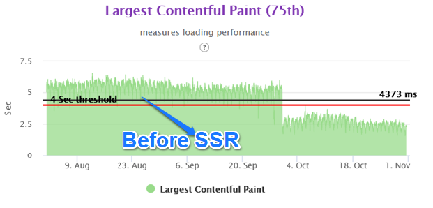
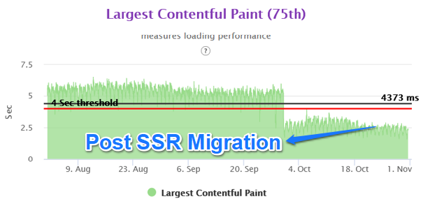
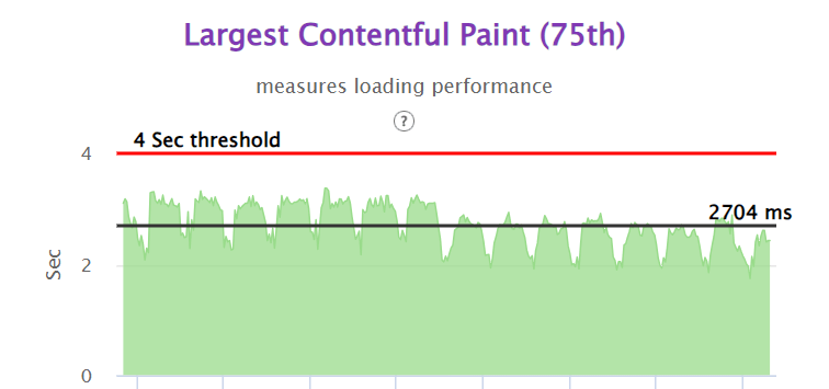
We were able to achieve close to 50% improvement in real user performance for LCP and bring it very close to 2.5 sec. This was possible because we used the server side rendered technique to get the very element in html causing the LCP.

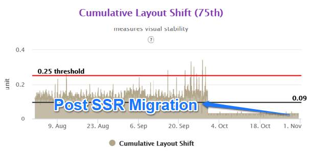
The Layout Shifts on the client side also reduced to a great extent as we were stitching the page on the server side for above the fold area. Thus any major movements in CLS were not happening in the client side area.

Greater control on served experience –

Because of the server side rendered experience, we were able to decide the experience which we wanted to serve to the user at the time of html generation. So we had better control on what elements we wanted to show and what not. Most importantly this also helped us decide on our category based views and type of user based view. .i.e admin, premium vs normal user etc. In the client side environment, this very problem caused a lot of complexity in our earlier React based code.

Cons

Higher backend latency – 

One of the tradeoffs of moving to server side rendering is the higher backend latency. If not managed correctly, it can degrade your FCP and by that means also degrade the LCP. One needs to carefully consider the structure of the page to ensure minimal increase in the backend latency. We did this by moving the below the fold functionality to client side rendering technique. Thus html generation time was reduced. We also created or modified existing API giving precise json data for backend integration. Better API response time helped us in reducing the backend latency. We also reduced the state variable size, as in nextjs, the state variable comes in the html. Larger state variables will cause the html size to increase.

Lesser support from Tech Community –

When we started working on the project, NextJS was relatively newer technology and lesser documentation was available. There were limited technical issues that were mentioned in various forums or the community had not brainstormed on the possible solutions by that time. However, this is not the case anymore and NextJS is a widely accepted technology.

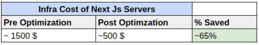
Infrastructure Investment –

One of the other areas which need attention is the sizing of the backend infrastructure and possibly the infrastructure on API side. By design, the server side rendering moves the processing to the servers. Thus naturally one needs more capacity servers to serve the front end code as compared to the React client side app. We believe this is a small price one needs to pay to improve the Core Web Vitals.

Summary 

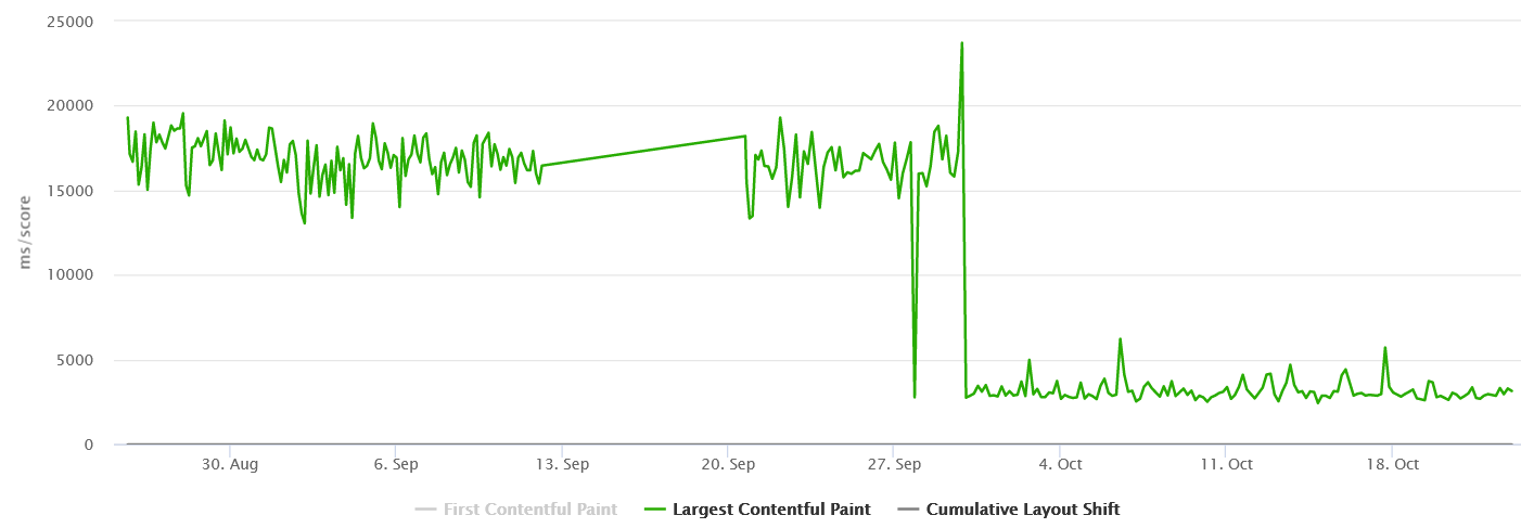
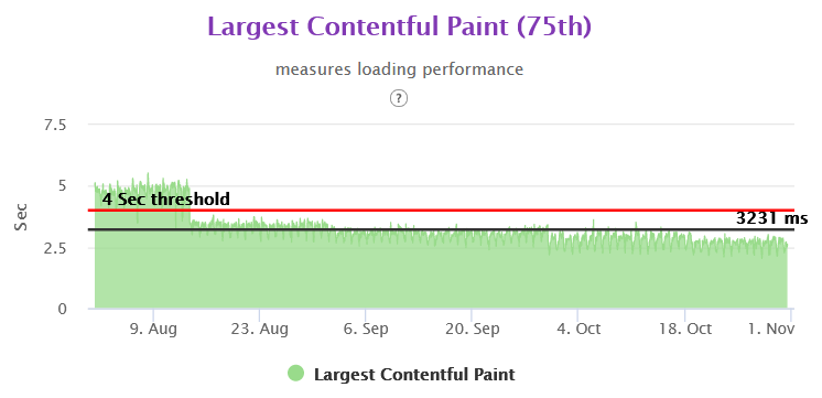
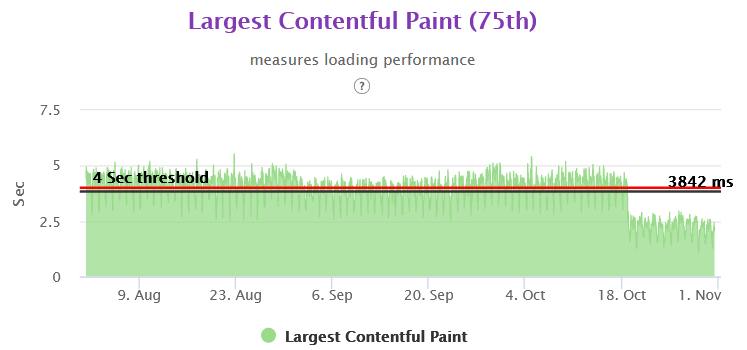
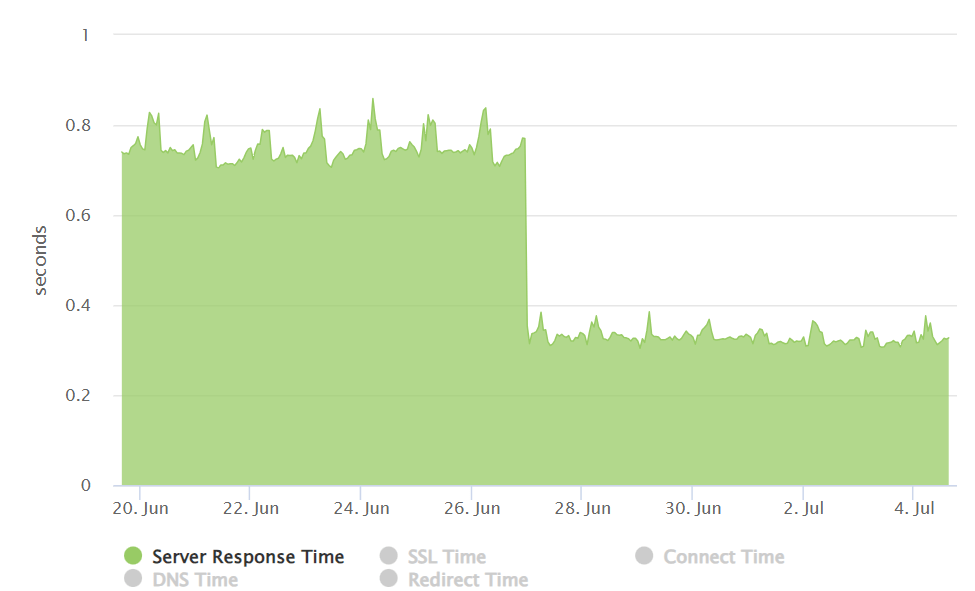
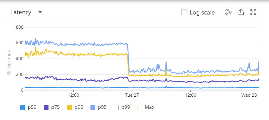
With the Nextjs migration, we were able to achieve the performance goal for Core Web Vitals in the fixed amount of time having no major slippages. The result graphs are as follows.

Mobile Homepage –

Mobile L1 Category Listing –

Mobile L2 Category Listing –

Mobile Product Details Page –

LCP 75th Overall in Gemini

CLS 75th Overall in Gemini

LCP PDP Mobile 75th in Gemini

CLS PDP Mobile 75th in Gemini

LCP Category Listing Page 75th Gemini

CLS 75th Category Listing Page Gemini

Homepage 75th Gemini

CLS Homepage 75th Gemini

The above content is an outcome of our experience while working with above problem statement. Please do feel free to reach out and comment in case of any feedback and suggestion.

Using EDA and K-Means for food similarity and diet chart

Health and wellness is complex thing and needs a holistic approach in your lifestyle to achieve and maintain it . Food is an important pillar for your health and fitness. Complexity increases as we move into details of food items to classify what is healthy and what is unhealthy that too taking the consideration of health and fitness goal of an individual. Food that might be suggested for a particular fitness goal might not be a fit for other fitness goal. High carbs food might be preferred in the cases where weight gain is the fitness goal however things might be opposite when it comes to weight loss.

There are thousand and millions of food items in the world and our task was to classify and suggest food items while looking at users health and fitness objective. Also, algo should be able to give recommendation of healthy food for the item which user eats in his daily routine.

The problem statement we had was to prepare a diet chart for users based on their goals. Every goal had its own calorie requirements, percentages of primary nutrients i.e. carbohydrate, fat, protein, and fibres. It made a lot of sense in this context to group foods together based on these properties to classify them on the basis of them being a high carb, high protein or high fat food item. Hence we decided to analyse the data and create clusters out of it.

We divided out process in following steps:

  1. Reading, Understanding, and visualising data.
  2. Preparing data for modelling.
  3. Creating Model.
  4. Verifying accuracy of our model.

Lets get started by Reading and understanding Data.

We in total were provided with 1940 records having 88 attributes. Out of which, according to our business requirement we needed attributes like foodName, carbs, protein, fat, fibre, weight, calorie, saturatedFat and volume.

Several entries in our dataset had missing values there can be two reasons for it.

  1. It was intentionally left out as some food items don’t contain any such attributes. It simply means the missing values represents zero.
  2. There was some error collecting data and during data entry those values were skipped.

Upon consulting datasource we imputed missing values with zero.

Next the calorie in the food items contained calorie from all the minerals and nutrients components in our food but since we are only concerned about few of those nutrients so we calculate calories using those only. And according to standard formula the calories comes out as.

calorie = 4*carbs + 9*fat + 4*protein

Hence, we came up with a derived metrics calorie_calculated using the following formulae.

Standardising values:

Columns carbs, fat, protein and fibre are in grams but for our analysis purposes we need to convert and standardize those to its calories representation. And since fibre is a non contributor in calorie we convert it to corresponding content per unit weight of food item.

Its very important in clustering algorithm for our data to not be correlated. But as we see from the heatmap presented below that as calories of food items increases so does fat, carbs, protein. In order to remove this correlation we took a ration with the calculated calorie.

Now once our data is clean and correlations are handled lets move to next step i.e. clustering.

What is clustering?

Cluster is a task of grouping a set of objects in such a way that objects in the same group (called a cluster) are more similar (in some sense) to each other than to those in other groups (clusters). It is a main task of exploratory data mining, and a common technique for statistical data analysis, used in many fields, including machine learning, pattern recognition, image analysis, information retrieval, bioinformatics, data compression, and computer graphics.

Its a kind of Unsupervised Learning, as we don’t provide any labels to data and we are trying to distinguish data in subgroups based on the features provided.

What is K-Means Clustering ?

K-means is a centroid-based algorithm, or a distance-based algorithm, where we calculate the distances to assign a point to a cluster. In K-Means, each cluster is associated with a centroid. It tries to make intra-cluster datapoints as similar as possible while keeping the clusters as far as possible.

It involves following steps:

  1. choose number of clusters, lets say k. This is the k in K-Means clustering
  2. select k random points in data as centroid.
  3. Measure the distance between first point and K initial clusters.
  4. Assign the first point to the nearest cluster. And we do the same step 3 and 4 for the rest points. And once all the points are in cluster we move on to next step.
  5. Calculate the mean of each cluster i.e. centroid of each cluster.
  6. Now we measure the distance from the new centroid and repeat step to 6. Once the clustering didn’t change at all during the last iteration we are done.

We can asses the quality of clustering by adding up the variation within each cluster. Since k-means clustering cant see the best clustering, its only option is to keep track of these clusters, and their total variance, and do the whole thing over again with different starting points.

Since, K-Means rely heavily on the distance its very important for our features to be scaled with mean around zero and with unit standard deviation. And the best feature scaling technique to use in this case is Standardisation.

The next question is what should be the value of K ?

For this we use what is called Elbow Curve method. It gives a good idea what K value should be based on Sum of squared distance. We pick k at the spot where SSE starts to flatten out and forming an elbow.

import matplotlib.pyplot as plt
from sklearn.preprocessing import StandardScaler
from sklearn.cluster import KMeans

required_cols = ['carbs', 'fat', 'fibre', 'protein']

scalar = StandardScaler()
df[required_cols] = scalar.fit_transform(df[required_cols])
df[required_cols] = df[required_cols].fillna(0)
df[required_cols].info()

wcss = []
 for i in range(1, 11):
     kmeans = KMeans(n_clusters=i, init='k-means++', random_state=42, max_iter=300)
     kmeans.fit(df[required_cols])
     wcss.append(kmeans.inertia_)
 plt.plot(range(1, 11), wcss)
 plt.title('Elbow curve')
 plt.xlabel("Number of clusters")
 plt.ylabel('WCSS')
 plt.show()

we get the above curve. From this we can say that optimal cluster and value of K should be around 4.

Analysis of Clustering

We are using Silhouette Analysis to understand the performance of our clustering.

Silhouette analysis can be used to determine the degree of separation between clusters. For each sample:

  • Compute the average distance from all data points in the same cluster (ai).
  • Compute the average distance from all data points in the closest cluster (bi).
  • Compute the coefficient:
Image for post

The coefficient can take values in the interval [-1, 1].

  • If it is 0 –> the sample is very close to the neighboring clusters.
  • It it is 1 –> the sample is far away from the neighboring clusters.
  • It it is -1 –> the sample is assigned to the wrong clusters.

Therefore, we want the coefficients to be as big as possible and close to 1 to have a good clusters. Lets analyse the silhouette score in our case.

result = {}
for i in range(2, 11):
    kmeans = KMeans(n_clusters=i, init='k-means++', random_state=42, max_iter=300, n_init=10)
    kmeans.fit(df[required_cols])
    pred = kmeans.predict(df[required_cols])
    result[i] = silhouette_score(df[required_cols], pred, metric='euclidean')

print(result)
We get result as:

{2: 0.31757107035913174,  3: 0.34337412758235525,  4: 0.3601443169380033,  5: 0.2970926954241235,  6: 0.29883645610373294,  7: 0.3075310165352718,  8: 0.313105441606524,  9: 0.2902622193837789,  10: 0.29641563619062317}

We can clearly see that for k = 4 we have the highest value of silhouette score. Hence 4 as an optimal value of K is a good choice for us.

Once we have k; we performed K-Means and formulated our cluster.

Next, we have prediction for values. Let’s say, we get nutrition composition for a specific goal. What we do, is scale that data in format that out model accepts and predict the cluster of the corresponding given composition.

y_pred = model.predict([food_item])
label_index = np.where(model.labels_ == y_pred[0])

As we get the label_index we filter out our food from our data and calculate the euclidian distance of each food item for the given composition.

dist = [np.linalg.norm(df[index] - food_item) for index in label_index[0]]

By this way, we can have the food items that are very closely related to the provided composition. And hence, we can prepare the diet the way we want. Like if we want to further filter out the data obtained from clustering into veg/NonVeg type etc we can perform those filtering.

The above content is an outcome of our experience while working with above problem statement. Please do feel free to reach out and comment in case of any feedback and suggestion.

Photo by Lily Banse on Unsplash

How to track sleep through Android app

Introduction

Our HealthKart application helps users to achieve help and fitness goal through our digital platform. Achieving help and fitness goal requires lots of things to be incorporated in daily routine and sleep is an important parameter for the same.

Sleep tracking can be done through couple of methodology and one of the popular way is to track it through smart band/watches. HealthKart app has integration with various health and fitness bands to track the sleep however we wanted to have another way to track the sleep of users through much easier way so that we can have maximize the data inputs from our users on this front.

In today’s time, all people use their phone from morning to night and first use the phone as soon as they wake up in the morning. So by using the user activity on the phone calculating the sleep time.

Now the question is what all activities are capturing for this. So the answer is only two and these are below.

  • User device screen comes in On Mode by user intention or any other application eg. phone ringing.
  • User device screen goes into Off Mode.

Android Components used for this

  • Started Service
  • BroadcastReceiver

Steps for using Android Components

  1. Create a SleepTrackerService that extends Service Class.
class SleepTrackerService : Service() {

  override fun onBind(p0: Intent?): IBinder? {
    return null
  }


  override fun onStartCommand(intent: Intent?, flags: Int, startId: Int): Int {
    Log.i(TAG, "Sleep Tracker Service")
    return START_NOT_STICKY
  }

  override fun onDestroy() {
    super.onDestroy()
  }

}

2. Make two BroadcastReceiver  ScreenOnReceiver and ScreenOffReceiver. So these two receivers for checking when the screen is coming in ON Mode and OFF Mode.  Register both the receivers in the Service class of onStartCommand method.

private var screenOffReceiver: ScreenOFFReceiver? = null
private var screenOnReceiver: ScreenONReceiver? = null

screenOffReceiver = ScreenOFFReceiver()
val offFilter = IntentFilter(Intent.ACTION_SCREEN_OFF)
registerReceiver(screenOffReceiver, offFilter)

screenOnReceiver = ScreenONReceiver()
val onFilter = IntentFilter(Intent.ACTION_SCREEN_ON)
registerReceiver(screenOnReceiver, onFilter)

3. To keep running the service in the background and the kill state of the application used the foreground service.

val notificationManager =getSystemService(Context.NOTIFICATION_SERVICE) as NotificationManager
createNotificationChannel(notificationManager)

val notificationIntent =
  Intent(this, SleepTrackerActivity::class.java)
val uniqueInt = (System.currentTimeMillis() and 0xfffffff).toInt()
val pendingIntent =
  PendingIntent.getActivity(
    this,
    uniqueInt,
    notificationIntent,
    PendingIntent.FLAG_CANCEL_CURRENT
  )

val builder: NotificationCompat.Builder =
  NotificationCompat.Builder(this, SLEEP_CHANNEL_ID)
builder.apply {
  setContentText("Sleep Tracking")
  setSmallIcon(R.drawable.notification_icon)
  setAutoCancel(true)
  setChannelId(SLEEP_CHANNEL_ID)
  priority = NotificationCompat.PRIORITY_HIGH
  addAction(R.drawable.blue_button_background, "TURN OFF", pendingIntent)
}

val notification = builder.build()
notification.flags = Notification.FLAG_ONGOING_EVENT

startForeground(SLEEP_NOTIFICATION_SHOW_ID, notification)

4. Now calculate the timing in ScreenOnReceiver and ScreenOffReceiver.


inner class ScreenOFFReceiver : BroadcastReceiver() {
  override fun onReceive(context: Context, intent: Intent) {
  }
}

inner class ScreenONReceiver : BroadcastReceiver() {
  override fun onReceive(context: Context, intent: Intent) {
  }
}

5. Unregister the receivers in onDestroy method when service is destroyed.

override fun onDestroy() {
  screenOffReceiver?.let {
    unregisterReceiver(it)
  }
  screenOnReceiver?.let {
    unregisterReceiver(it)
  }
  with(NotificationManagerCompat.from(this)) {
    cancel(SLEEP_NOTIFICATION_SHOW_ID)
  }
  super.onDestroy()
}

We capture these on/off screen event data for user and send it to backend for calculating the sleep behind scene through our algorithm.

This methodology is much easier to implement at the same time user does not need to wear his gadget all the time. Obviously there are few trade off here too however this was the balanced approach to maximize the data inputs from our end users.

This tutorial is outcome of our own experience of implementing the sleep tracking. Your suggestions and feedbacks are heartily welcome.

Photo by Lauren Kay on Unsplash